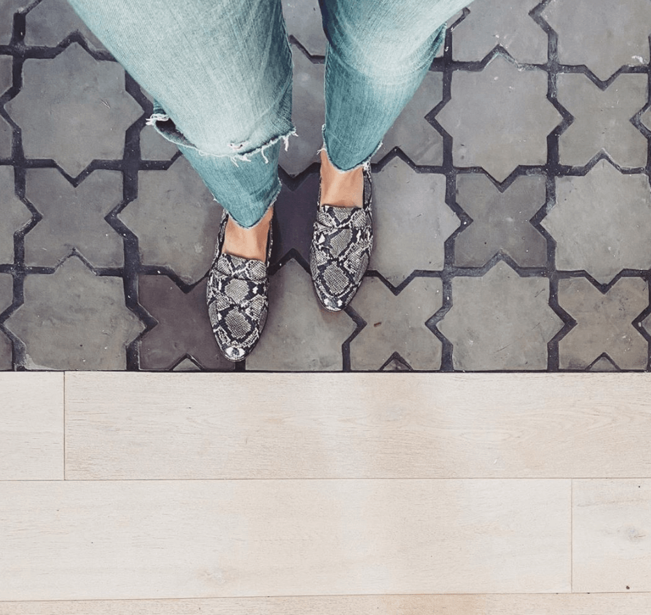
Our Grout Rule of Thumb
Grout can play an important role in design and shouldn’t be overlooked.
For us it depends on a variety of things, but if clients like high contrast and pattern then a grout that stands out is preferred. For some, they want a minimal grout line so we try to get the grout to blend in and make it hardly noticeable.
A lot of the spec homes we design are done in-house. We were on a Modern Farmhouse kick for awhile, like most, so we used bricks and slates to create that tone. Now we’re transitioning into Modern Cottage styles so we are experimenting with classic patterns and shapes but with a clean application. We’re still doing Coastal Modern projects which is in our natural wheel house – think light blues, whites and shiplap.
With that though, grout can make a simple/affordable tile pop and look more expensive.
Bedrosians did a great infographic about grout below:

Grout samples aren’t hard to find – you can snag one online or at your local Home Depot.
Some of our favorite grout colors: Avalanche, Warm Grey, Cobblestone and Charcoal.